Designing a dashboard for business intelligence (BI) reporting is a task of both art and science. A picture is definitely worth more than 1,000 words if you ask a data analyst. Sieving through layers and layers of data, to finally distill the insights into a single page of visuals is not an easy task. In this post, I will try to break down the process into more granular considerations when designing a dashboard.

 Target audience
While understanding your target audience is essential, it is a stifling consideration and can lead to repetitive design. Understand who will use this dashboard, and understand the larger business question they hope to answer; but do not limit yourself to it. Once you have functional clarity, move to the visual aspect. Some business users have a strict vision they expect to see. As a developer, help them break that mold by showing a mock-up of what you think best represents the information.
Before starting, another good practice is to ask each user to list five questions the dashboard should answer, and then add your own questions. Only when you have a fair idea what the users believe the purpose of this dashboard should be, should you revisit these questions. Check whether the dashboard only answers the listed questions, or whether you can obtain a meaningful analysis by also asking random questions.
 Getting the data
ACD – Always collect data. Moreover, always get all of it. Period. In today’s age of sophisticated data analysis and visualization tools, which are capable of handling terabytes of data, don’t hold yourself back. You may find an aspect your client has not yet thought about. Presenting it in a way that forces your audience to think about it leads to innovations. This should always be a consideration for visual design.
Typically, the data models for supporting visualizations have had hierarchical, fixed designs. A more recent trend is use of an associative model, which allows self-service BI capabilities and the flexibility for visual analytics, rather than a static data summary. Users can see various dimensions associated with the data and instead of just consuming report content, they can actively engage with their data getting answers to very specific questions without a lot of training.
 Selecting visualizations
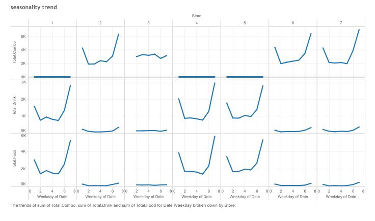
Keep it simple. I cannot emphasize this enough. When it comes to creating mind-blowing visualizations, please remember that they should not obscure the message. I once created a 3×3 matrix of time series graphs to compare sales, returns and inventory for different products across various days of the week, and spent a good 20 minutes explaining what it was, before I could get to its value. I’m sure the next d3.js visual that you conjure will be beautiful, and the audience would love to interact with it and turn all the gears to see different combinations; but if you are presenting complicated numerical analysis, use simple visuals.

Also, a seasoned analyst would have already observed, there are different visuals for different tasks. Are you comparing things? Are you showing relationships or composition? Based on these and similar questions, choose the most effective visualization.
Remember to have a focus point on dashboards, around which you construct a story. For example, a dashboard focusing on patient health should not have elements from patient visit tracking or billing. It is distracting and never makes for a good story. Instead focus only on health parameters over different dimensions.
Keep the number of visuals limited to four or five. Firstly, it ensures clarity and secondly there is less chance of repeating the same information in different ways. It also ensures that when used with multiple filters, the user is not confused by an unlikely combination of filters. Have a mobile BI strategy as part of the plan. It doesn’t matter how big or small the organization is, the ability to have critical information at its fingertips is always helpful. Products like Qlik Sense have the ability to scale the visuals dynamically to suit the presentation screen, and you should leverage such simple but elegant design concepts.
Lastly, if it is an interactive dashboard, educate the user about the various slicing and dicing options it has so they use its full potential. The BI dashboard has evolved over the last few years and now has amazing visual analytics capacities. It is no longer just an assembly of charts and tables, but much more dynamic than that. The BI products today give the business users self-service capabilities to slice and dice and create their own analysis. Let your users have it, enabling insight discovering and process clarity.

