
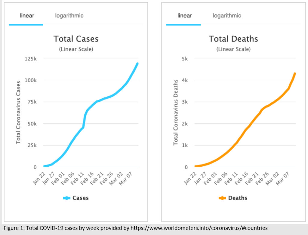
I received an interesting email this morning from a performance support software company detailing how they could help during these uncertain times, driven by the coronavirus (COVID-19). At the beginning they shared some facts about COVID-19, including these two graphs (figure 1), created by Worldmeters.info.
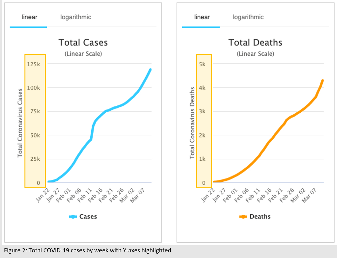
Their intentions were well-meaning, but I think they missed the mark with these graphs. Here, side-by-side, we see two graphs with drastically different Y-axes, highlighted in yellow (figure 2).
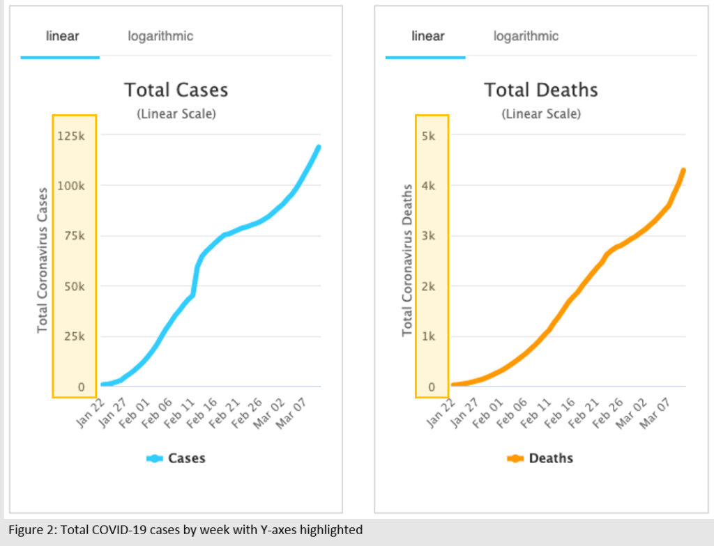
The unaware viewer, someone who is quickly skimming the article, might look at these graphs and interpret that the number of COVID-19 deaths is climbing just as quickly as the number of cases. By placing two graphs side-by-side, the author is driving readers to view the relationship between the two lines. In this case, these graphs misrepresent the number of deaths as it relates to number of cases by using very different ranges in the Y-axis. It is true that the number of coronavirus deaths climbs each day, and I am not trying to downplay the tragic loss of life accompanying this pandemic, but these graphs do not accurately represent how the number of cases relate to the number of deaths.
 Part of my job is creating graphs to help people better understand data. Generally, it is easier to interpret a picture than a table of values. This is one of the reasons infographics and pictograms have become such a popular way to share data. But when the picture gets manipulated by changing the scale of the axes or cutting off the y-axis to show a more comparison, it suddenly becomes a very poor means of visually communicating information.
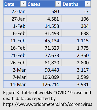
Here, I’ve included a table (figure3) that contains the data used to create the graphs in the previous figures. While tables make it more difficult to observe trends in data, we can see clearly here that the number of deaths is not increasing at the same rate as the number of cases, as what appears in Figure 1 and Figure 2.
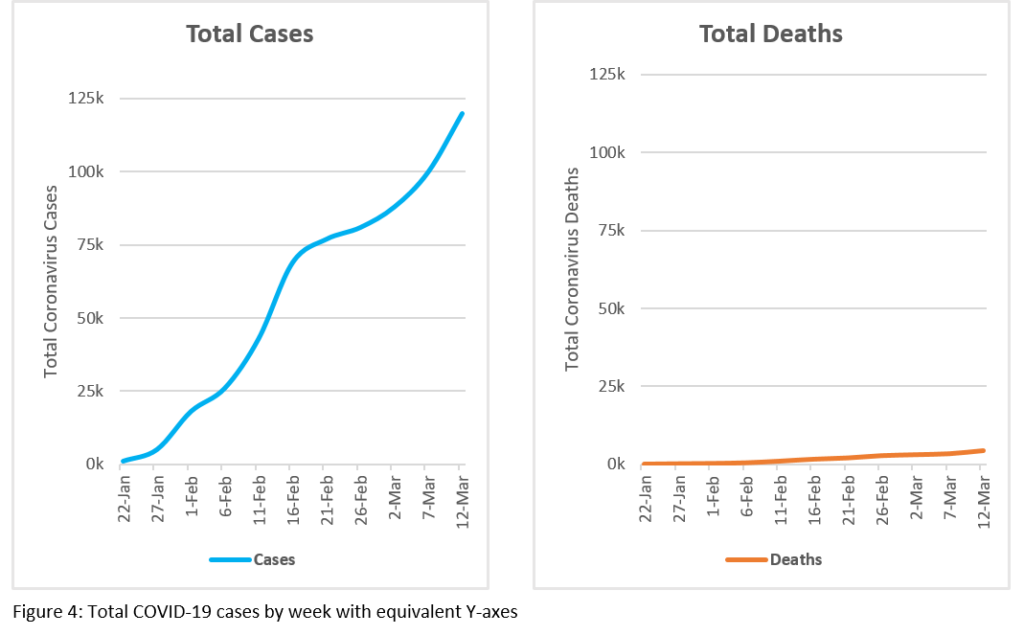
I’ve recreated the graphs using the exact same range in each of the Y-axes (figure 4). Visually, these graphs tell a completely different story than the previous ones. The data hasn’t changed, but the first glance interpretation has. Suddenly, the number of deaths does not appear to be climbing at the same drastic rate as the number of cases. Now, these side-by-side graphs can be viewed as they relate to each other, appropriately comparing the number of deaths with the number of cases using the same Y-axis.
During this time of rapid updates and information sharing, I encourage you to be aware of what you’re viewing. Read the small print. Look at the scale of the axes on graphs. Read the titles of the axes and the graphs. If you see something, say something. Help others to understand and interpret misleading data visualizations by sharing them with your network! What graphs have you seen today that misrepresent reality?